Book Design and a Book’s Motif
Over the next while, I will offer a few posts on the subject of a book's design and a book's motif. I will comment on books I have published and designed, as well as books where design and theme have caught my attention.
As an example, I will begin with Great Women Artists, a rich resource published by Phaidon in 2019.
Here is a photo of the cover.
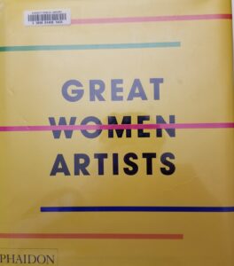
The book is large: 10 X 11¾ inches with 464 pages. Notice the book almost is square and does not emphasize the vertical. The book cover is yellow. There are five parallel horizontal lines (red, green, red, blue, and orange), four of which do not span the page. The center line (red) crosses the title word WOMEN, using strike through text, WOMEN, throughout the text. There are many more design features, but these will be sufficient to make the points I want to emphasize.
Typography is inherently symbolic, as are all design elements. This must be kept in mind when trying to discern the design messages conveyed by the designer's decisions.
The color yellow is used for the entire field of the book cover (front, back and spine). The most common symbolism of the color yellow is the sun. Solar imagery is typically associated with male. So here, this male element is pushed to the background. The color is so prominent that this aspect might be missed. Against this yellow background, the black text becomes prominent and is made more prominent by the use of all capitals, type that is bold and without serifs. Why a non-serif font? It is used only for the cover. All interior text is set in serif type. Well, there is a design rule that says: Don’t use serifs if you want to appear futuristic or modern. So, here, with the male solar element pushed to the background, the theme of great women artists is forgrounded, boldly. and with a modern and futuristic intention. What about the horizontal parallel lines? In symbolic terms, the horizontal is associated with the feminine and the vertical with the masculine. So here, the feminine is emphasized. Parallel means "side by side" and here we see that lines of different dolor are in parallel, side by side. A strong element pointing to diversity (different colors) belonging side by side, belonging in parallel. Why are all but one of these lines "complete," that is traversing the entire cover. Because these aspects of diversity are not yet complete.
And, now, what of that solid line through the word WOMEN that traverses the entire field. This is a bold declaration that the gendered adjective (women) is no longer applicable in speaking of greatness. It is not a distinction that belongs. As Gombrich said: "There really is no such thing as Art. There are only artists."
There is rarely any mention of design in a published book. Perhaps this little note will trigger some deeper looking.